BRANDING | BRAND ASSETS
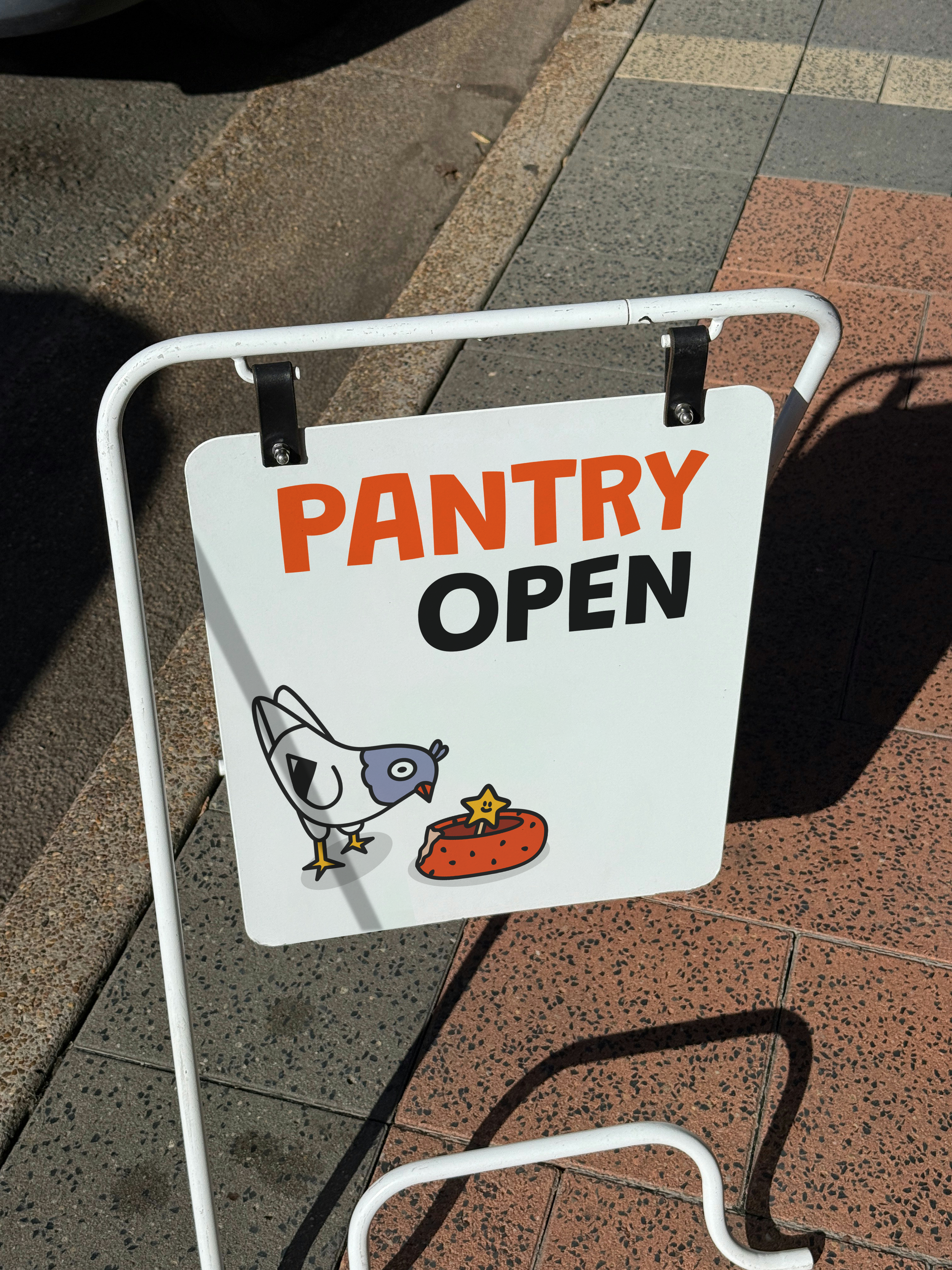
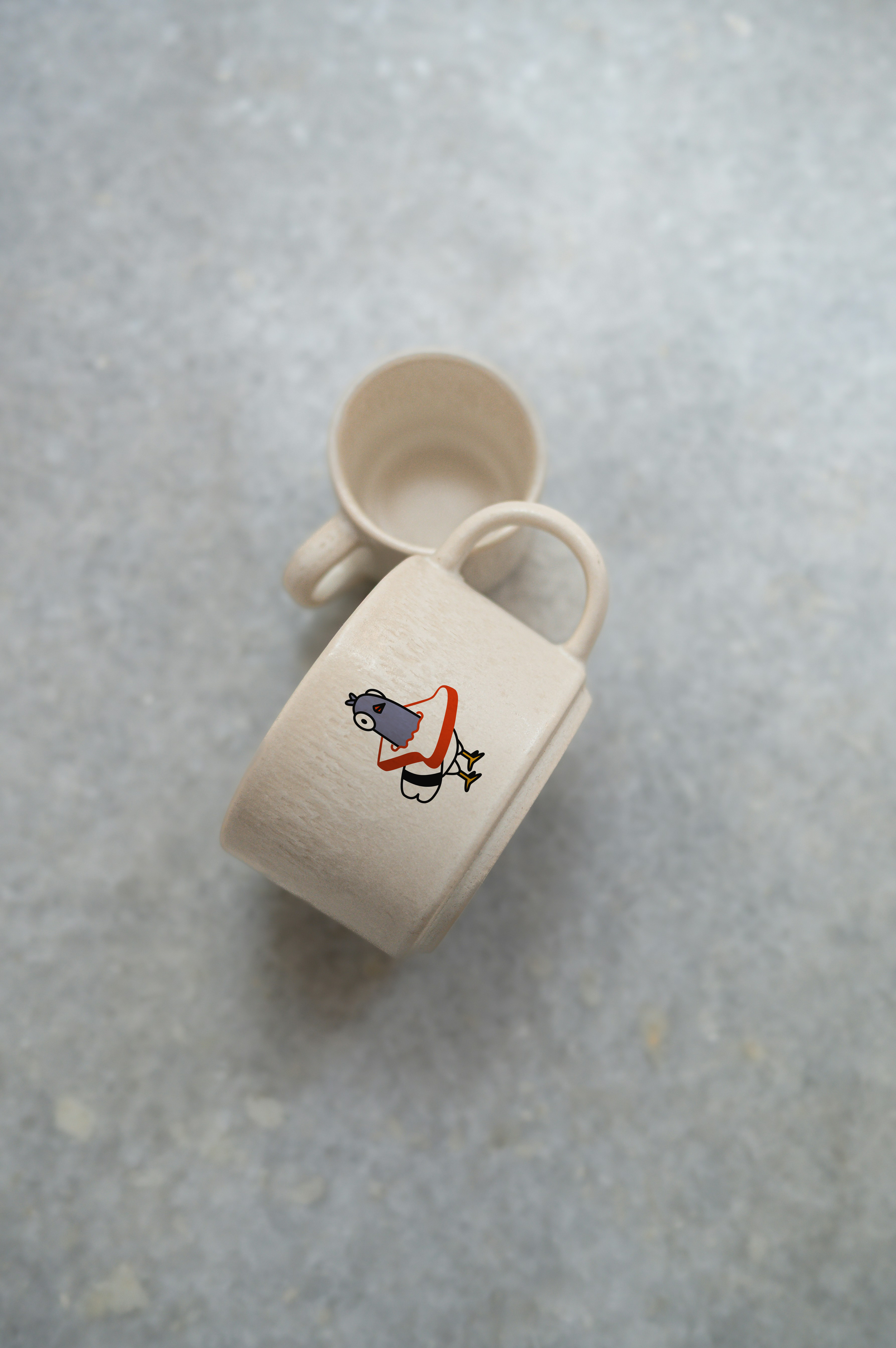
The Pigeon Pantry
The Pigeon Pantry is a fictional café created as a personal passion project.
This year I wanted to complete more passion projects to improve my skills and also to find my style. It has been fun and a learning process to divert from client work and to push my limits as a creative.
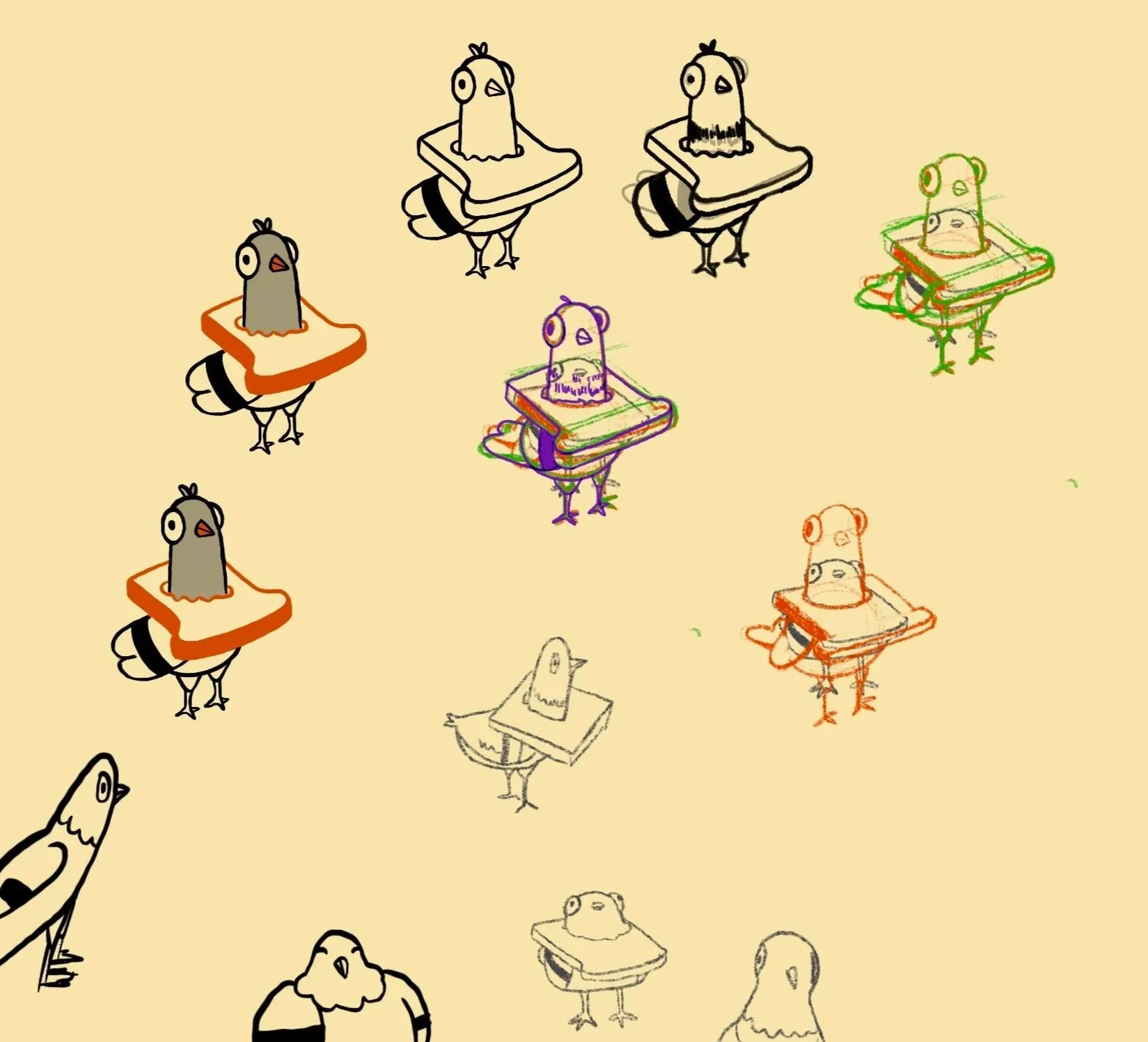
The Pigeon Pantry became a place to bring together my illustration and graphic design practice. For building a cohesive visual world through character, colour, and brand systems.
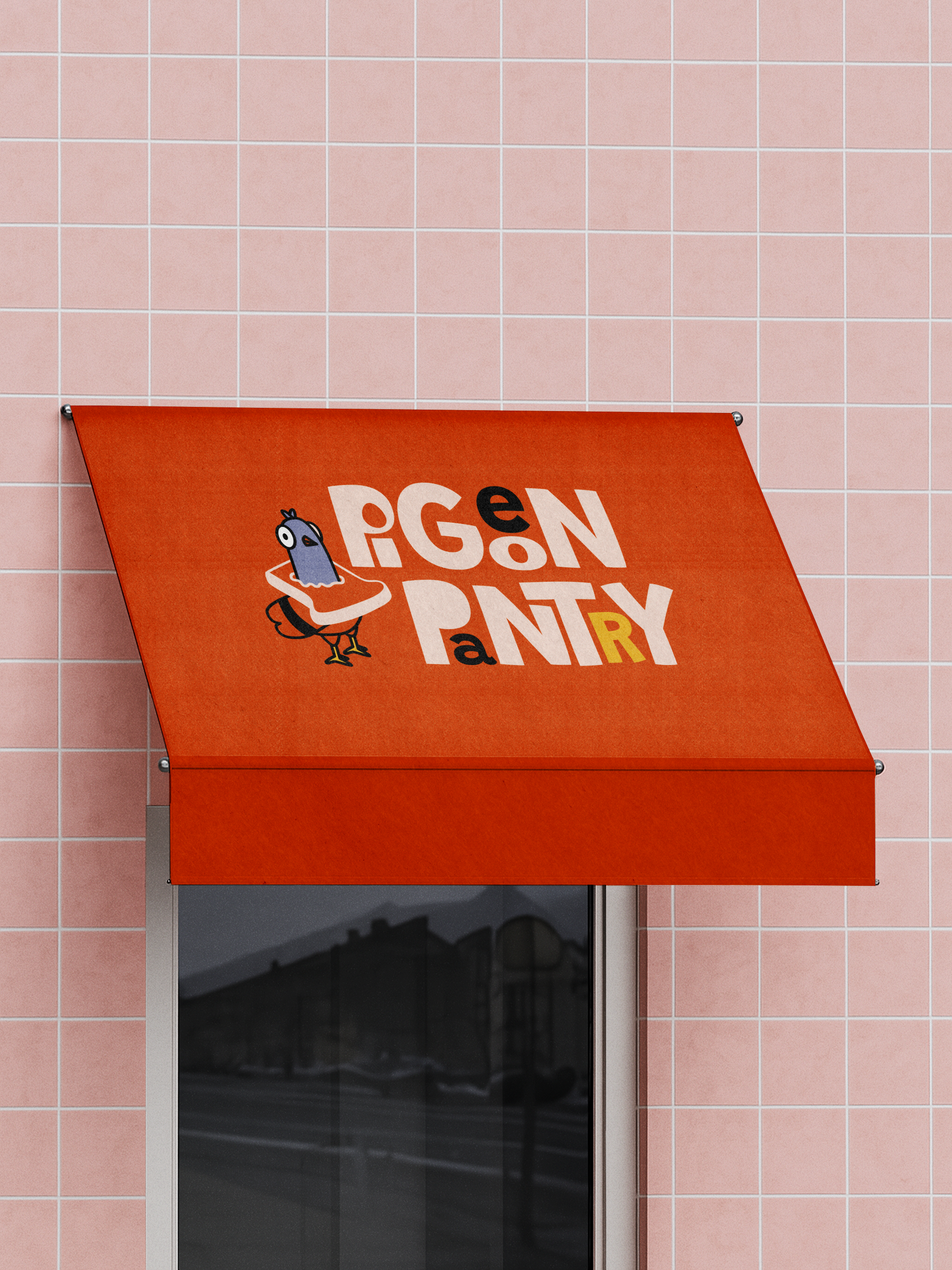
A quaint brand world, designed to feel familiar from day one.
On this fictional branding project, I began with a focused moodboard and research phase. I used an existing café as a loose reference point — not to copy, but to understand context, placement, and how the brand might live in the world.
The café is imagined as a place to slow down: situated in a design district, centred around regulars, and built around a mascot with a strong, distinct personality. Something familiar, slightly quirky, and warm. A brand that could naturally extend into merchandise and small moments beyond the café itself.
From there, I explored typography, colour, and illustration to build a visual language that felt modern, cosy, and character-led — allowing space for play while staying grounded.
Brand identity elements include:
Logo and supporting marks
Colour palette and typography
Character design with multiple poses
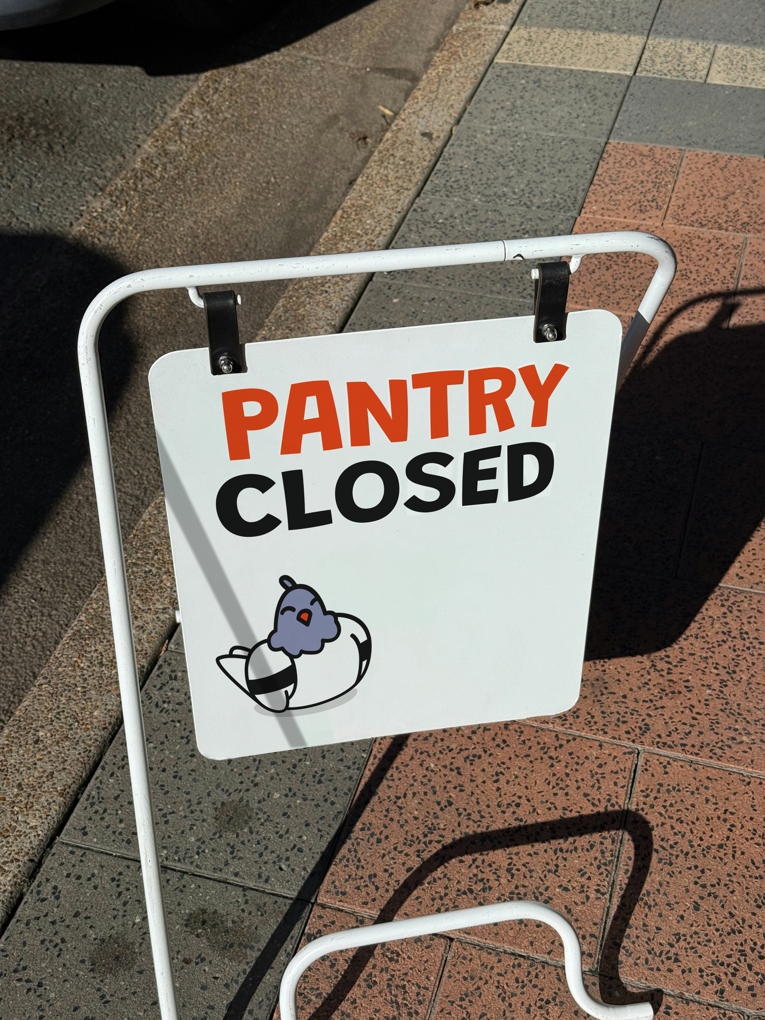
Environmental applications such as signage, glass decals, awning
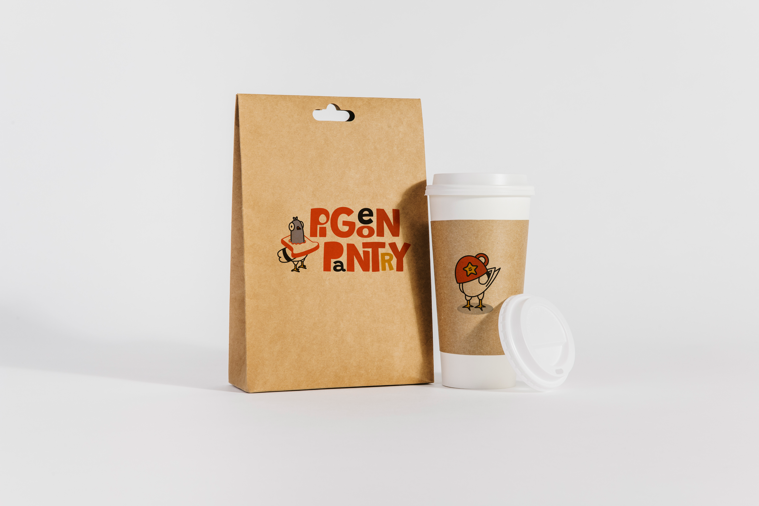
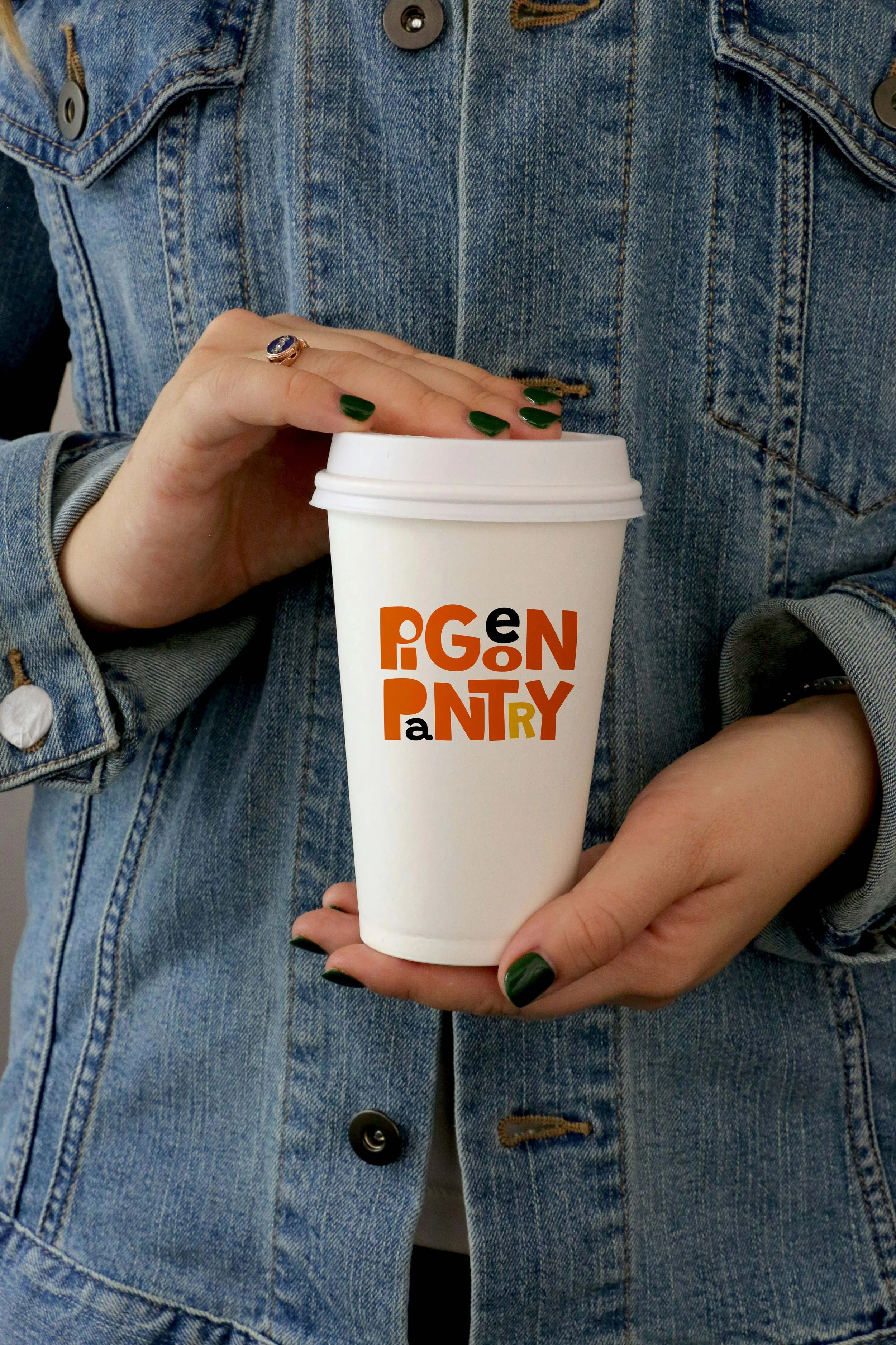
Takeaway cups, bags, and a membership stamp card