PRINT & DIGITAL TEMPLATES | BRAND BOOK LAYOUT
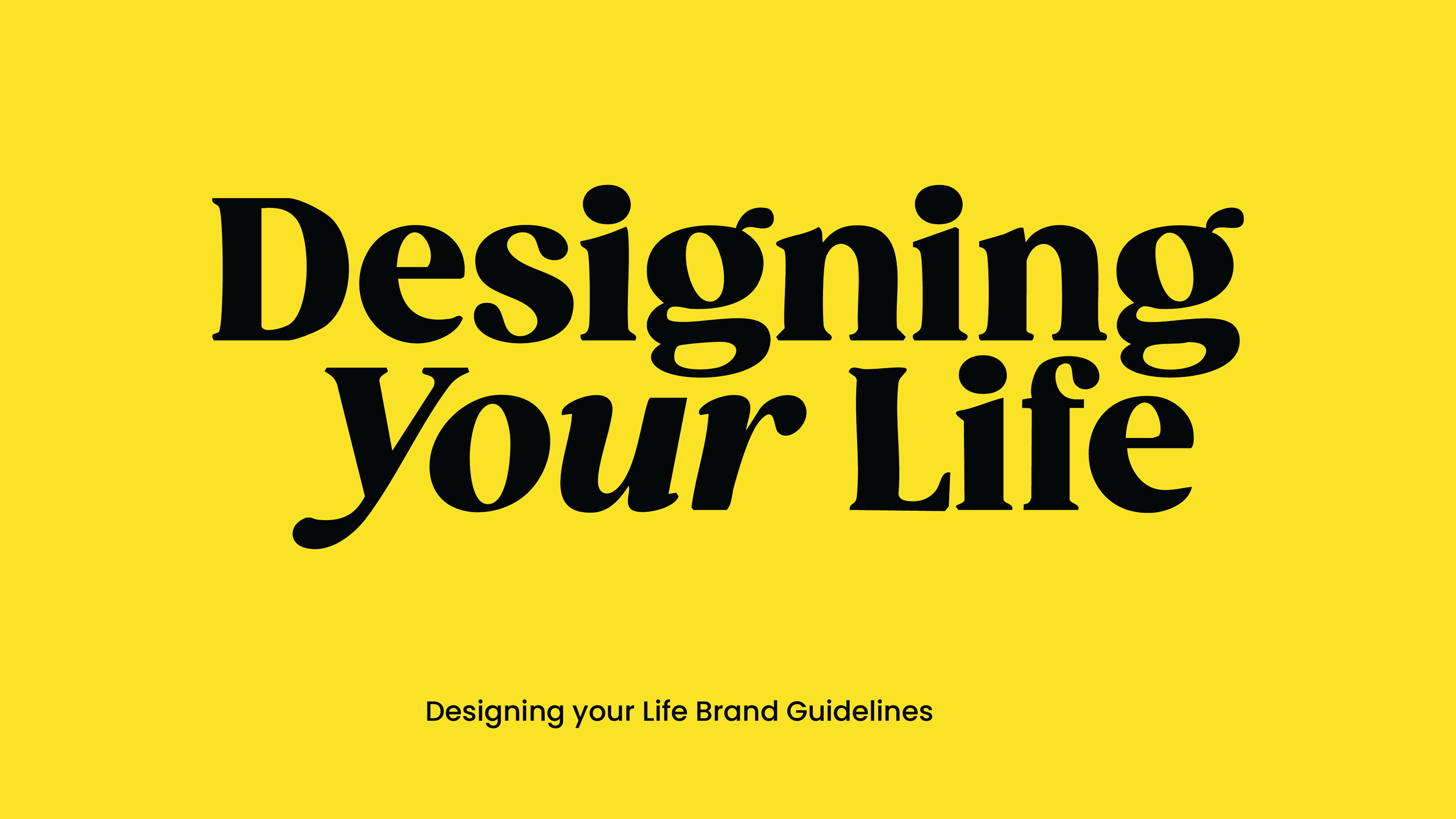
Designing Your Life
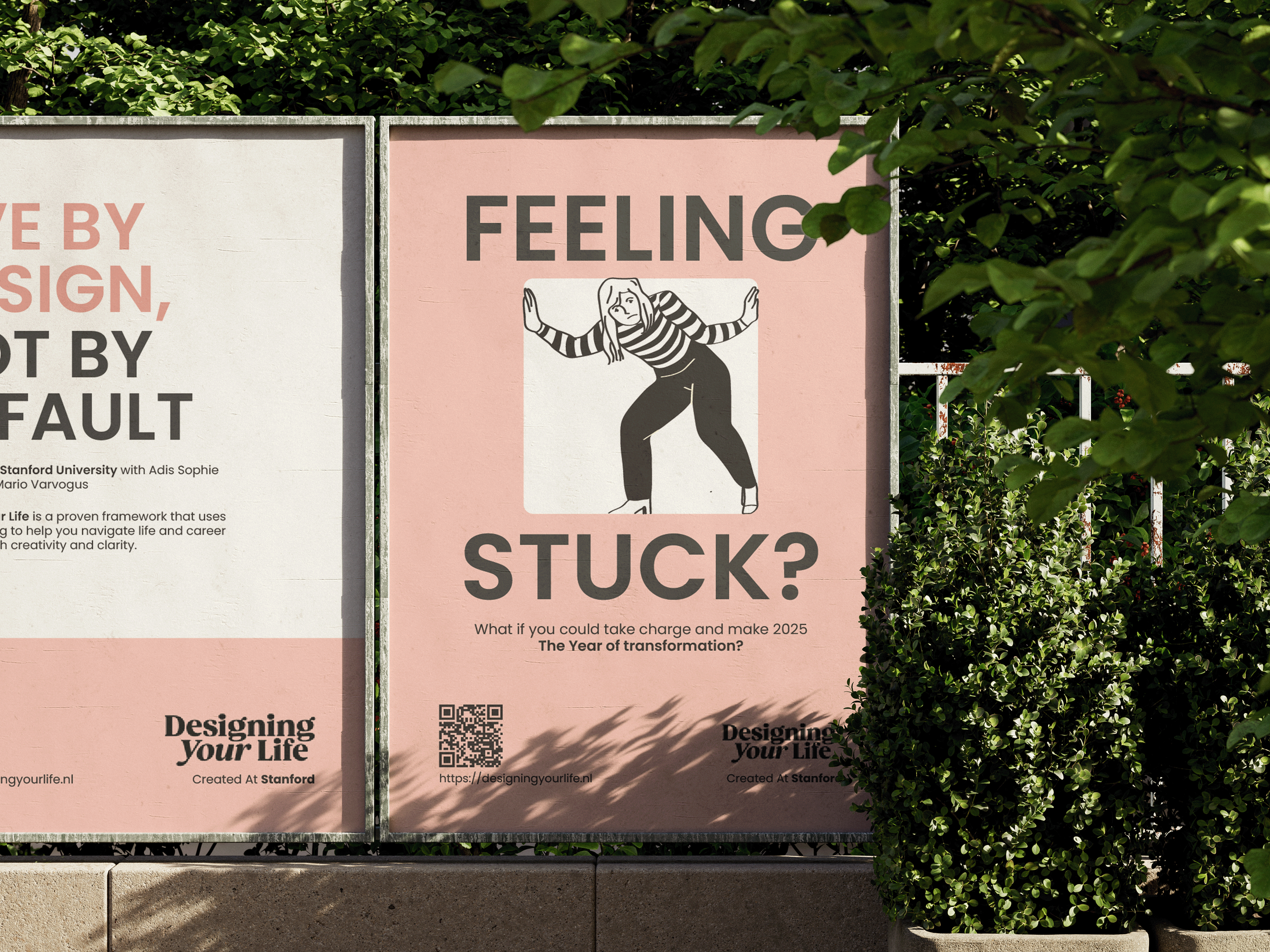
DYL Netherlands was entering a new phase and needed a visual identity that reflected their updated brand direction. The existing visuals didn’t fully communicate the brand’s values or connect clearly with their audience.
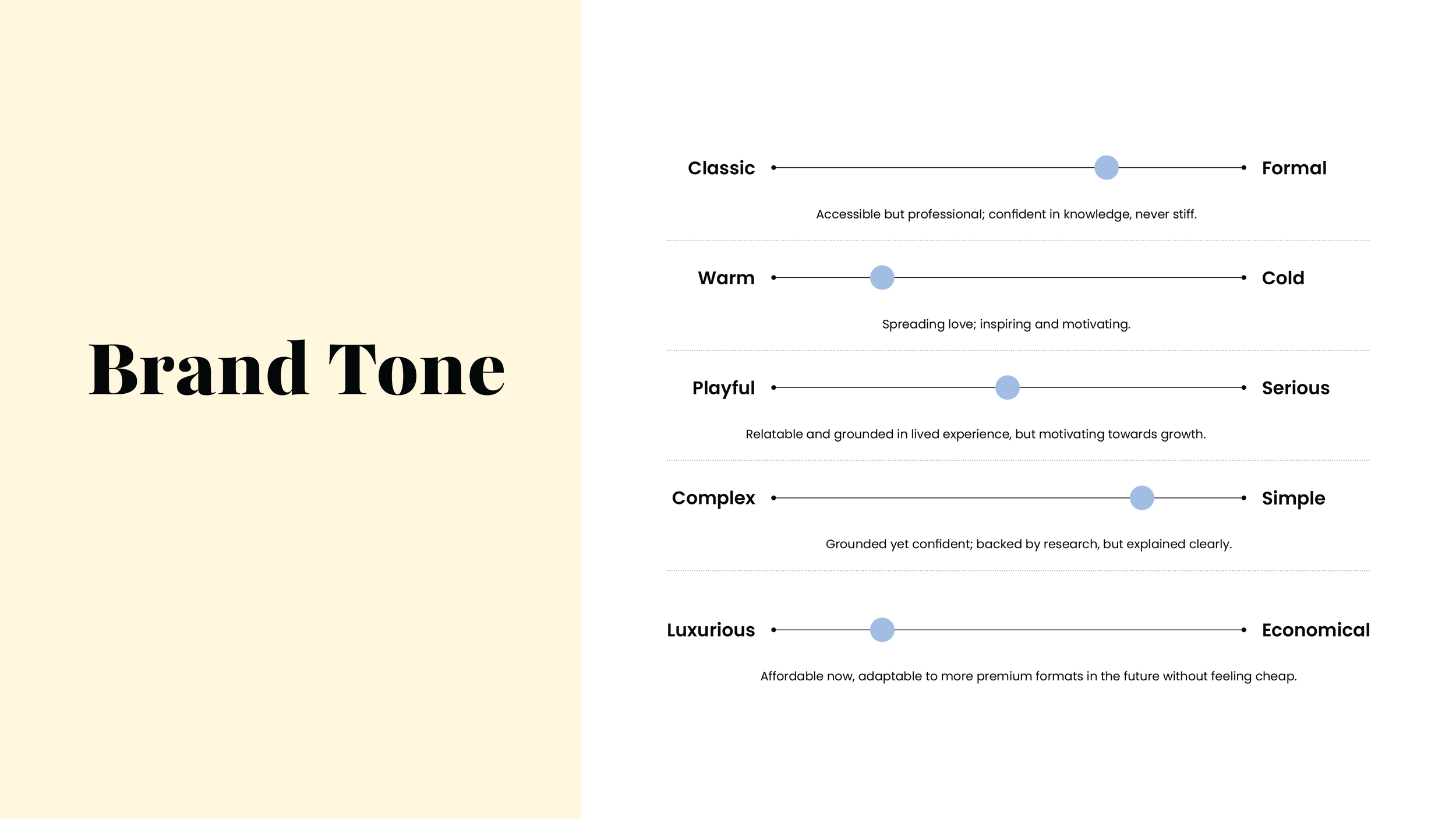
The goal was to define a visual tone that felt approachable, modern, and professional, and to ensure consistency across both brand collateral and the website.
THE PROCESS
Research & Foundation. I collaborated closely with the DYL Netherlands team to explore design templates and visual systems that aligned with their new direction. Through multiple iterations, we identified the visual “vibe” that best represented the brand and resonated with its target audience.
Alongside this, I worked with the website designers to ensure the visual language translated seamlessly into the site’s layout and structure.
THE SOLUTION
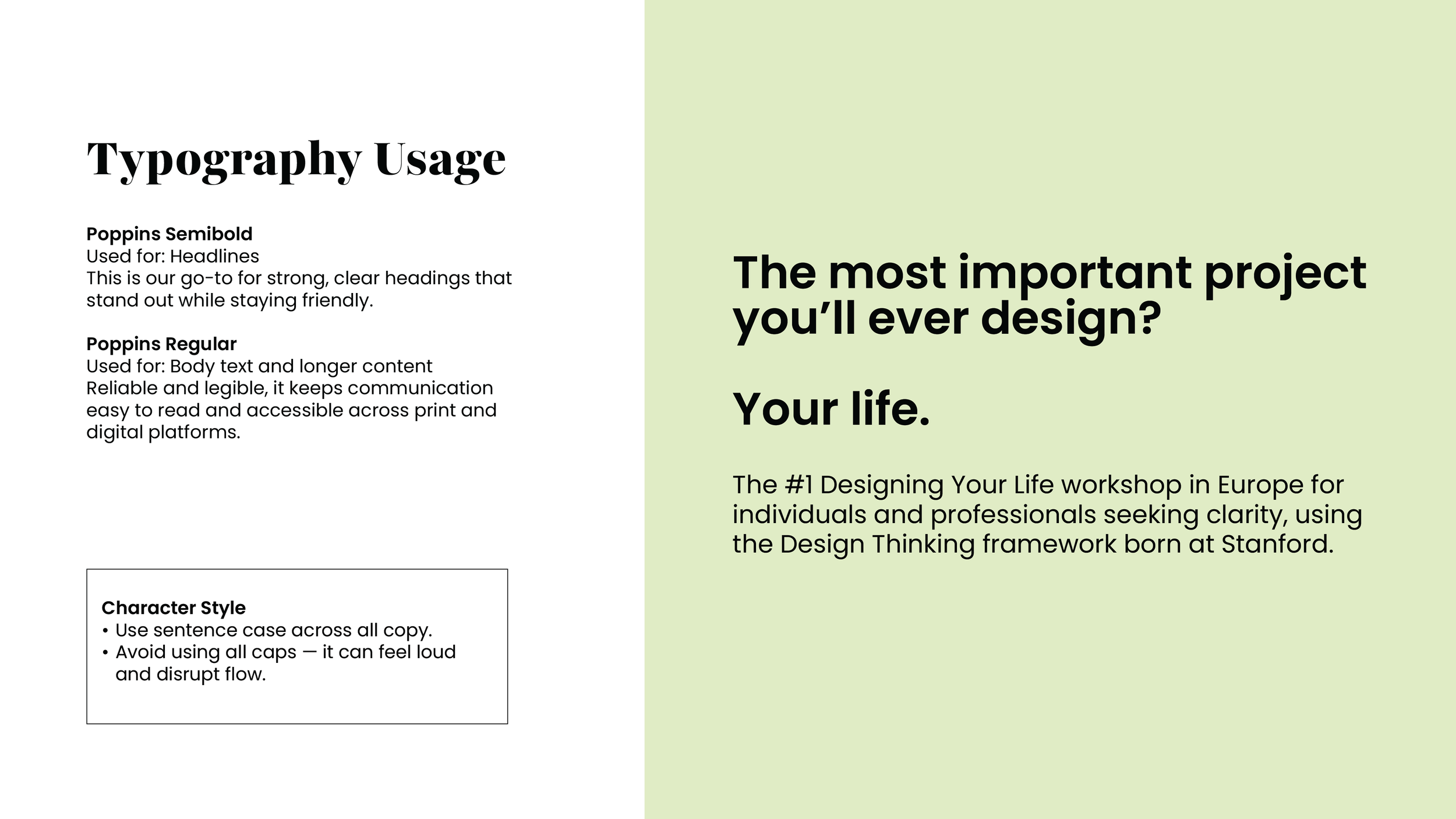
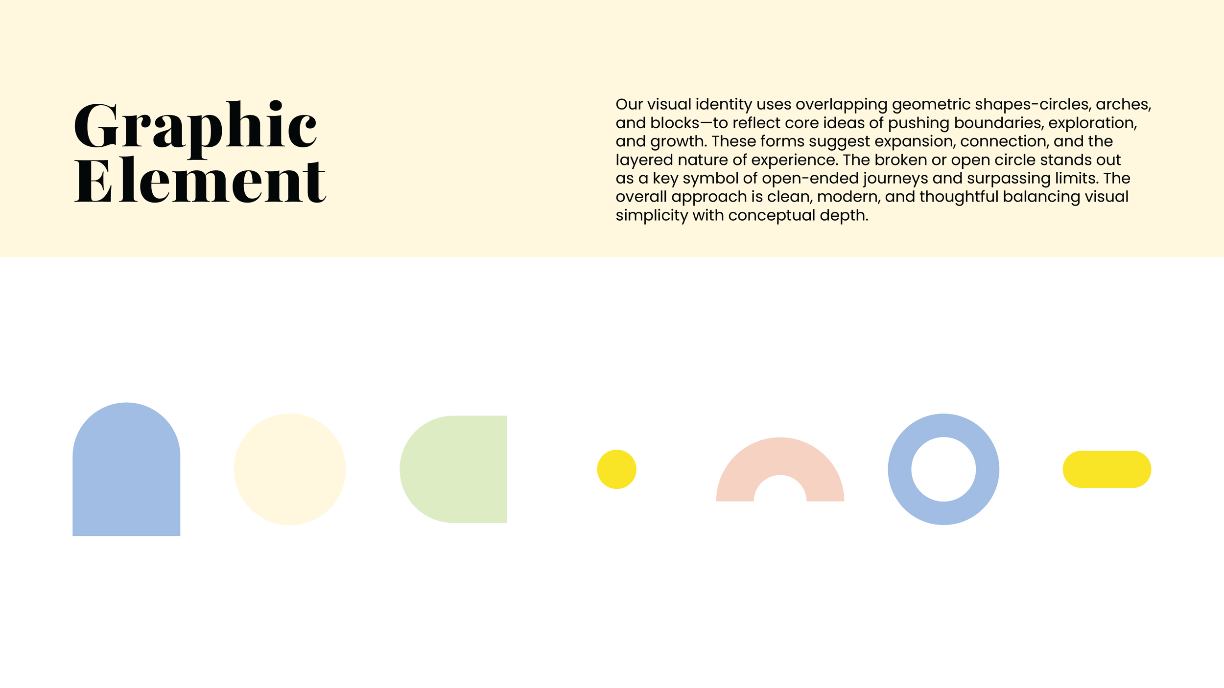
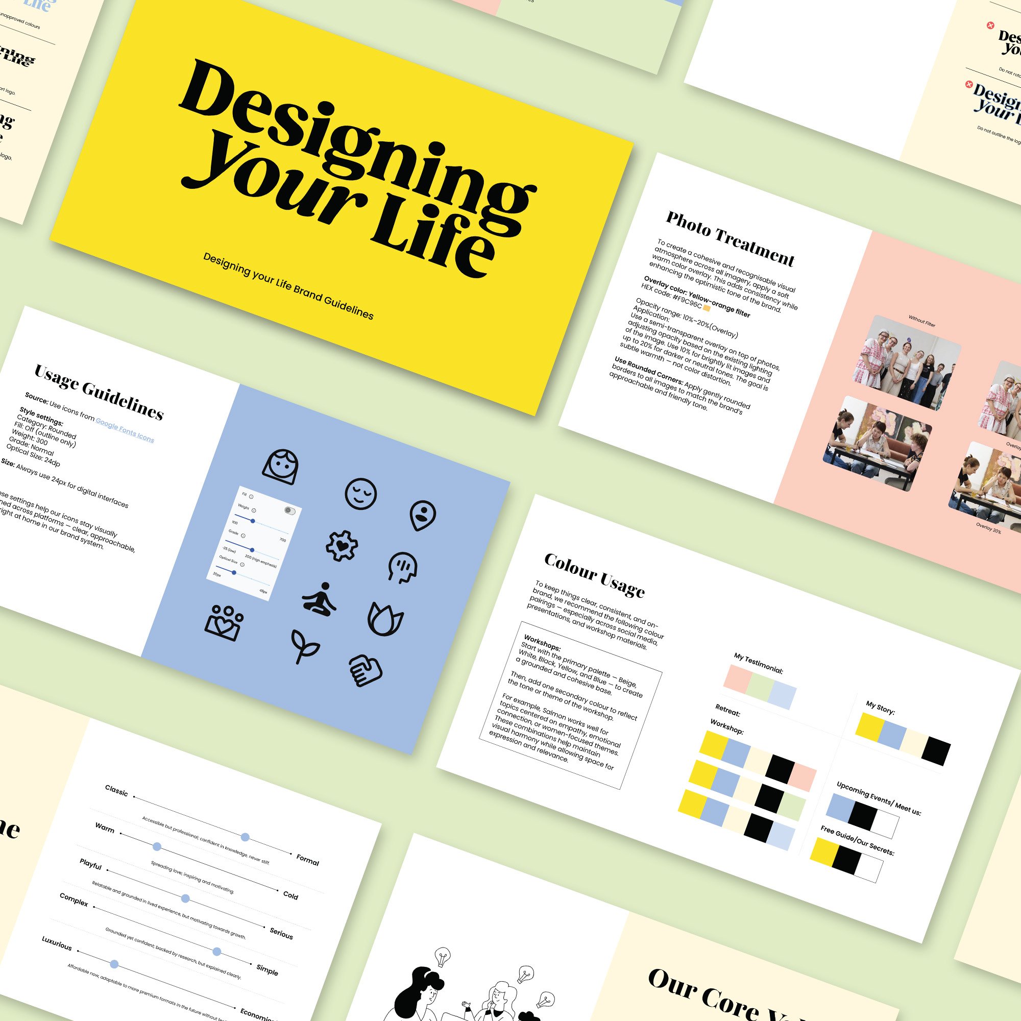
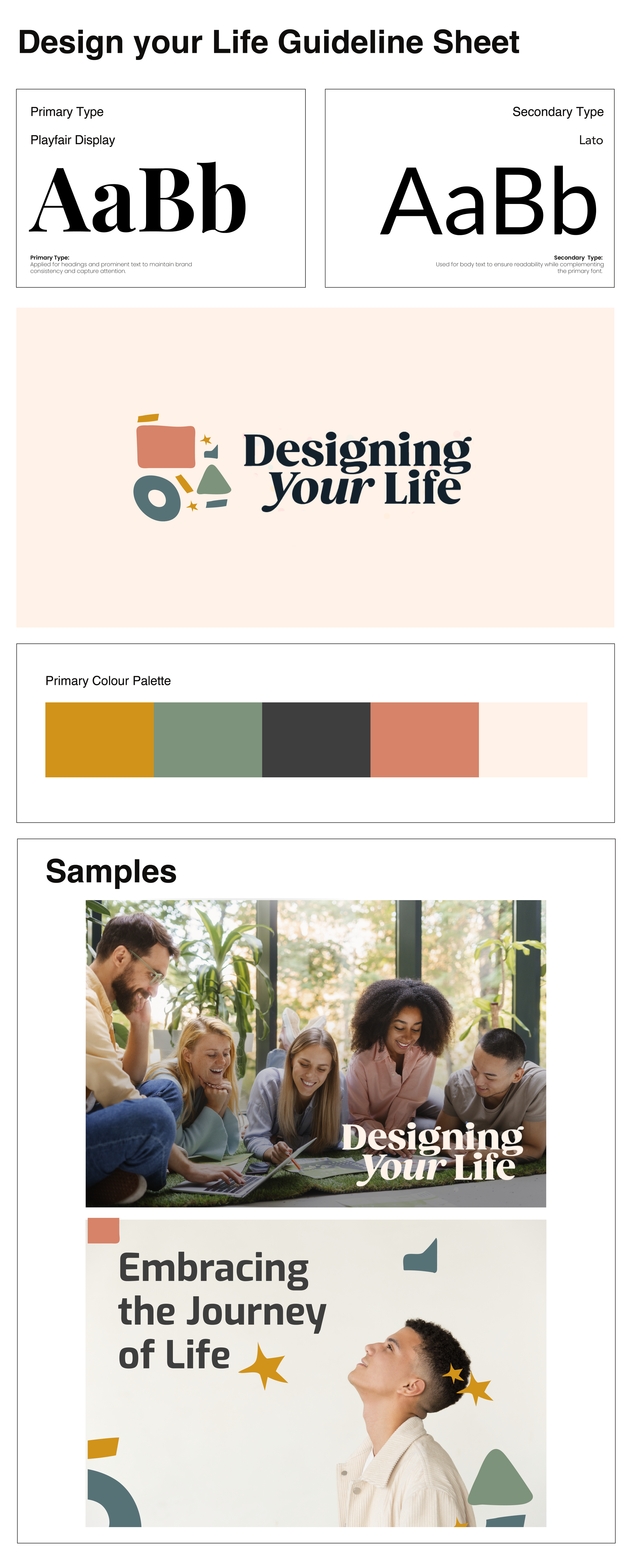
Final Direction & Execution The result was a cohesive brand system with a flexible, easy-to-use collateral structure. I designed the brand book layout and developed templates for both print and digital use, allowing the client to maintain brand consistency independently.
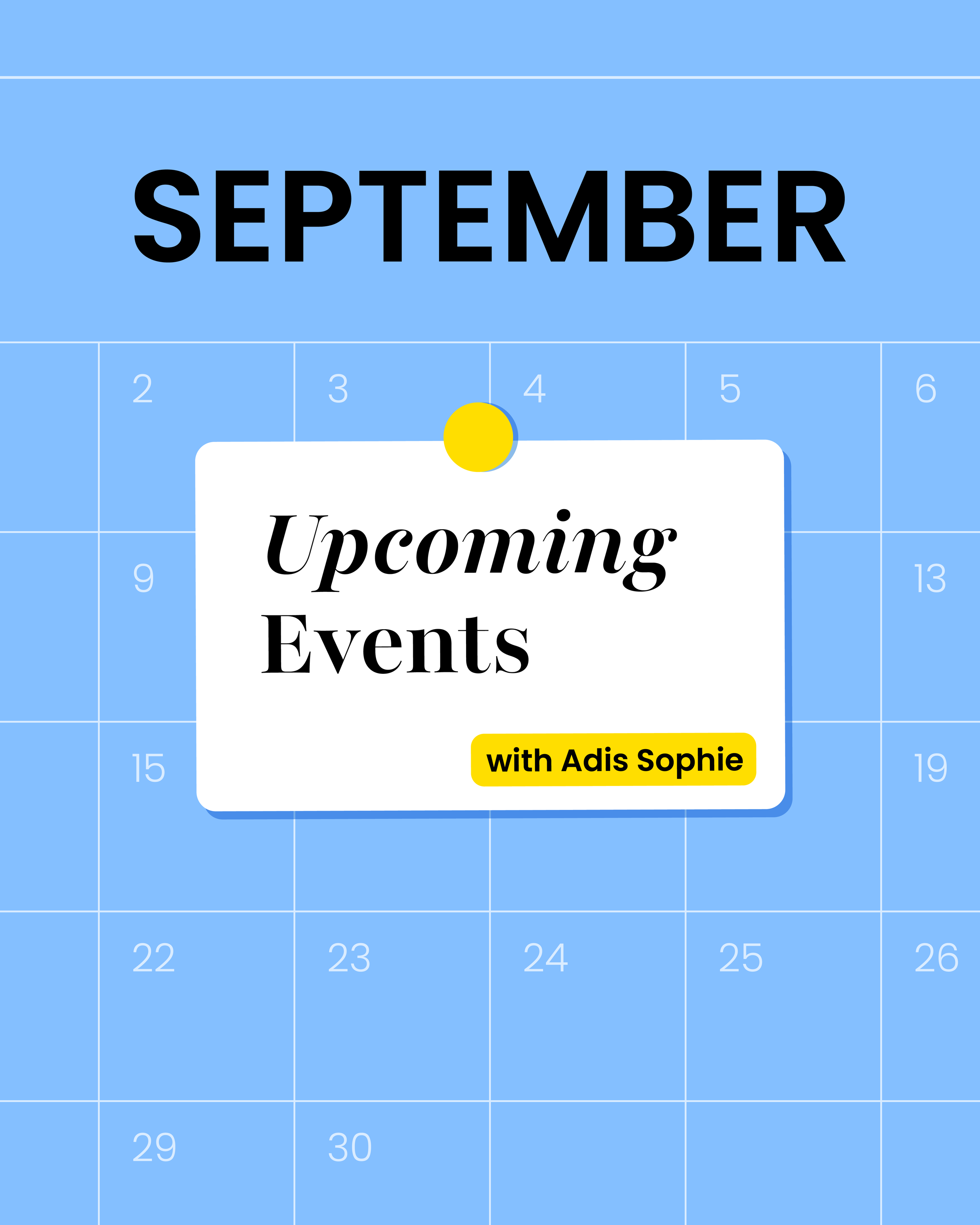
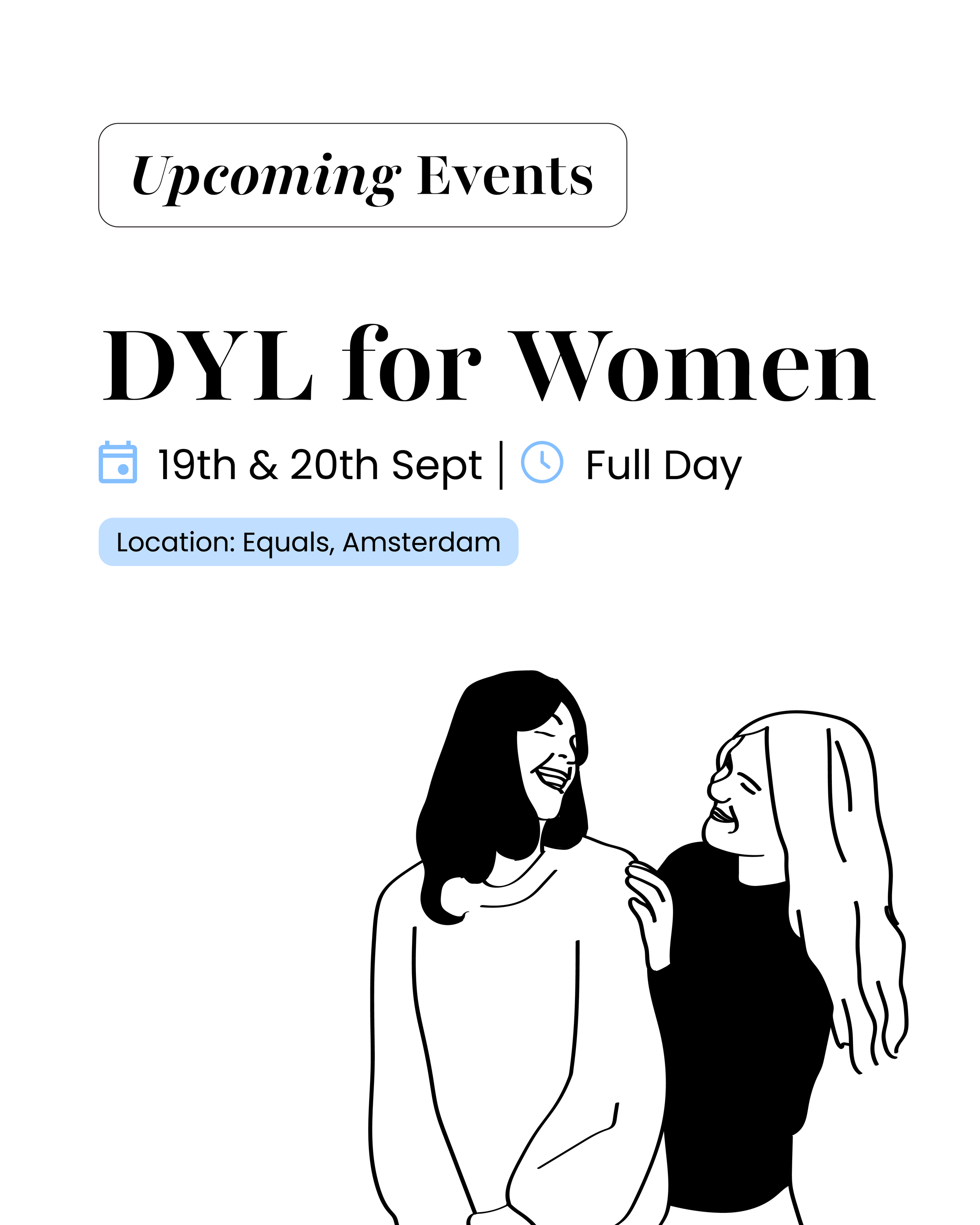
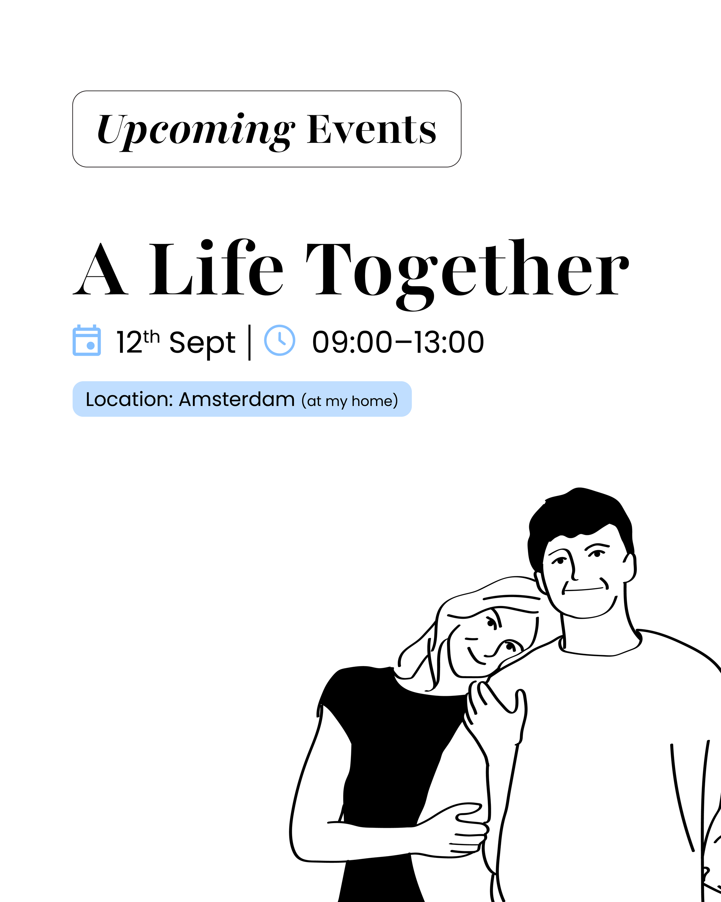
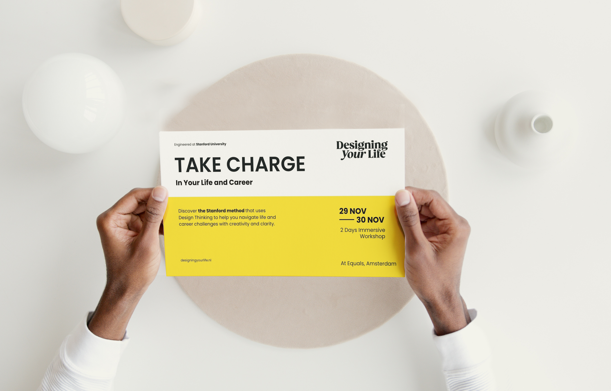
Brand Book Layout (selected pages)